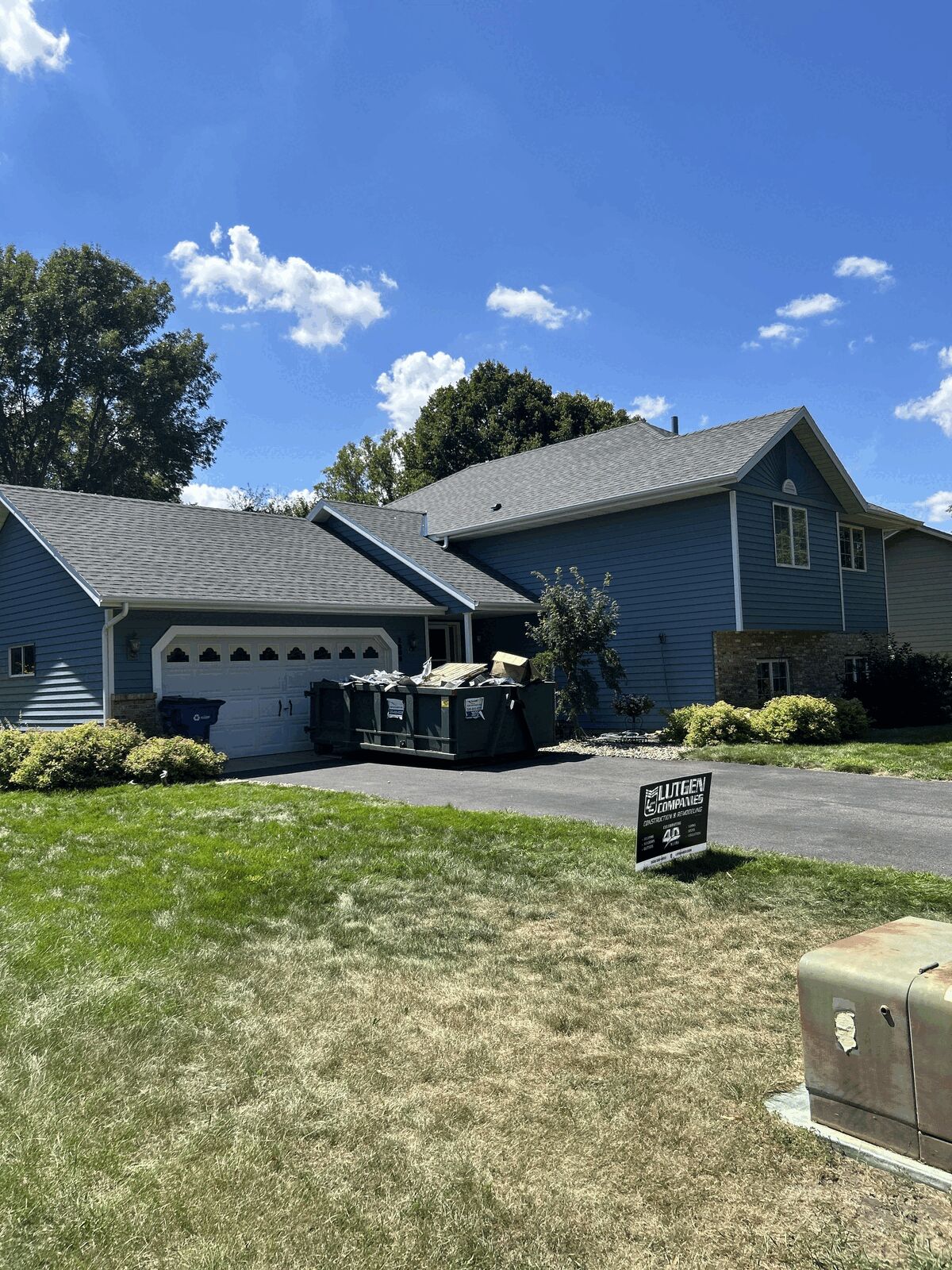
Your roof is more than just protection from the weather. It's the single largest color block on your home's exterior. Sometimes covering more visual real estate than your siding, trim, or landscaping. Get the shingle-to-siding pairing right, and your whole house reads as intentional and pulled together. Get it wrong, and even expensive materials can look mismatched.
GAF's Timberline HDZ is the best-selling architectural shingle in North America, and in our region of central Minnesota, comes two color groups: High Definition and Bold Definition
High Definition Colors are:
- Barkwood
- Charcoal
- Hickory
- Hunter Green
- Mission Brown
- Pewter Gray
- Shakewood
- Slate
- Weathered Wood
Bold Definition Colors are:
- Chestnut Valley
- Cliffside
- Midnight Mesa
- Sierria Sand
We’ll walk you through basic color theory and then apply it directly to the Timberline HDZ lineup so you can pick a shingle and siding combination with confidence.
A Brief Color Theory Crash Course
You don't need a design degree to use color theory. You need four concepts:
- Hue
- Temperature
- Value
- Undertone
Hue
Hue is the actual color family. Think generally: blue, brown, gray, red, green, etc.
Temperature
Color temperature is whether a color leans warm (reds, oranges, browns, golds) or cool (blues, bluish grays, greens). This is the single most important variable for pairing your roof with your siding. Mixing warm and cool without intention is the most common color mistake.
Value
This is how light or dark a color is. Striking exteriors usually have a clear light-to-dark relationship between roof and siding rather than two tones holding the same value. When you match values your curb appeal tends to look flat and muddy from the street.
Undertone
This is the subtle secondary color hiding inside a "neutral." Grays can lean blue, green, or purple. Browns can lean red, orange, or yellow. Two colors that look neutral in isolation can clash once they're side by side, because their undertones fight each other. This is why bringing an actual shingle sample to your siding (or vice versa) can be more helpful than pairing colors from memory.
Pairing Strategy
Now that we know some basic theory, there are three pairing strategies that you can take with your design:
- Complementary contrast: pair warm with cool, or light with dark, so the roof and siding read as distinct, deliberate layers (example: a charcoal roof with warm cream siding).
- Analogous harmony: staying within the same temperature family so everything blends softly (example: a brown-toned roof with beige or tan siding).
- Monochromatic depth: staying in one hue family but varying the value, (example: a dark charcoal roof over medium-gray siding) this can read as sophisticated and modern. But take care to have enough contrast to avoid looking flat.
The Timberline HDZ Color Lineup
Let's break each major shade down by temperature and undertone and match it to siding using the strategies above.
Warm, Earthy Shingle Colors
Weathered Wood
GAF's most popular color nationally, and for good reason. Weathered wood is a warm gray-brown blend with enough variegation to read as neutral in almost any light. Because it straddles the line between warm and cool, it's the most forgiving color on this list.
Best siding pairings: Cream, warm white, gray-beige, or sage green. Use analogous harmony. soft, blended, natural colored siding lets Weathered Wood's variegation do the visual work.
Barkwood
A rich, dark brown with earthy depth, more clearly warm compared to Weathered Wood.
Best siding pairings: Tan, cream, or warm white using analogous harmony; or deep forest green for a more layered, natural materials look. Avoid pairing Barkwood with cool blue-gray siding the undertones will clash, since one leans warm and the other leans cool without enough contrast in value to make it feel intentional.
Hickory
A reddish-brown with real depth and visual punch. This is the boldest of the classic warm neutrals.
Best siding pairings: Light-colored siding (white, cream, light gray) works through complementary contrast which lets Hickory's warmth and darkness anchor the composition. Hickory also pairs naturally with red or orange-toned brick, since the warm undertones echo each other rather than compete.
Shakewood
A lighter, honey-toned brown with warm golden undertones, reminiscent of natural cedar shake.
Best siding pairings: Cream, tan, or sage. This is a color that wants to sit in the same warm family as its siding rather than contrast against it. Analogous harmony is usually the right move.
Cool, Neutral Shingle Colors
Pewter Gray
A cool light gray with subtle blue undertones. Its strength is in letting the rest of the exterior lead.
Best siding pairings: White, light gray, or navy blue accents. Because Pewter Gray is already understated, it works well with analogous cool siding. Add a navy front door and trim for a small pop of complementary contrast.
Charcoal
The second most popular Timberline HDZ color, and the most versatile dark neutral in the lineup. It's a deep, near-black gray with just enough warmth in the granule blend to avoid looking flat.
Best siding pairings: This is the color where complementary contrast shines. Pair Charcoal with white, cream, or light gray siding for a classic high-contrast look, or with black window frames and trim for a modern, monochromatic effect. Charcoal is genuinely one of the few shingle colors that works across nearly every siding temperature, which is part of why it sells so well.
Slate
Cool, blue-gray tones with more visible depth than a flat gray.
Best siding pairings: Blue, gray, or white siding, staying in the cool family for harmony, or a deep navy for a cooler monochromatic palette. Avoid pairing with warm beige or tan siding unless you're intentionally going for contrast. The blue undertone in Slate will otherwise look slightly off against warm neutrals.
Green and Red Accent Colors
Hunter Green
A deep, classic green that reads as timeless rather than trendy.
Best siding pairings: White or cream siding is the traditional, reliable choice where genuine complementary energy between the green roof and neutral warm siding. Hunter Green also works on wood-toned or natural-material exteriors, where it reinforces rather than competes with the material palette.
The Bold Definition Collection
GAF's newer collection was designed specifically to push contrast further than the High Definition lineup.
Cliffside
A cool, dramatic slate-inspired tone. This is deeper and more saturated than Slate or Pewter Gray. It pairs well with white, light gray, or blue siding for crisp complementary contrast, and with black trim for a striking monochromatic cool palette.
Chestnut Valley
A warm brown with more depth than Barkwood or Hickory. It works best with cream or warm white siding for analogous harmony or with brick in complementary red-brown tones.
Midnight Mesa
A near-black, high-drama shingle. Reserve it for siding that can hold its own in contrast. White, light gray, or even black-and-white combinations work. Note that anything mid-toned will just look washed out next to this.
Sierra Sand
A warm, sandy neutral with more visual texture than Weathered Wood. It suits Southwestern and Tudor style homes especially well, paired with stucco or warm-toned stone in the same family.
A Simple Decision Framework
If you only remember one rule from this entire guide, make it this:
Match temperature first, then decide on contrast.
- Determine whether your existing (or planned) siding is warm or cool. An actual paint chip or siding sample outside in daylight works best as indoor lighting may distort undertones significantly.
- Decide whether you want harmony, roof and siding in the same temperature family. Or contrast, roof and siding in different temperatures or values.
- Check the undertone. Two grays can clash if one leans blue and the other leans green. Two browns can clash if one leans red and the other leans yellow.
- When in doubt, lean neutral. Weathered Wood, Charcoal, Pewter Gray, and Barkwood are the four best-selling colors nationally precisely because they pair reasonably well with the widest range of siding tones. This can be a genuinely useful fallback if you're renovating in stages and don't want to lock yourself into a narrow siding palette.
Roofing color decisions are hard to reverse. A roof is a decades-long commitment. Whichever direction you lean, request a physical sample and view it against your actual siding, in daylight, before making a final call.

Comments